I am going to compare and contrast the way artists such as George Condo, Damien Hirst and Goldie link music, art and graphic design to promote and market albums. I will investigate George Condos self-professed psychological cubism, consumerist contemporary art of Damien Hirst, and the street art work of Goldie
George Condo
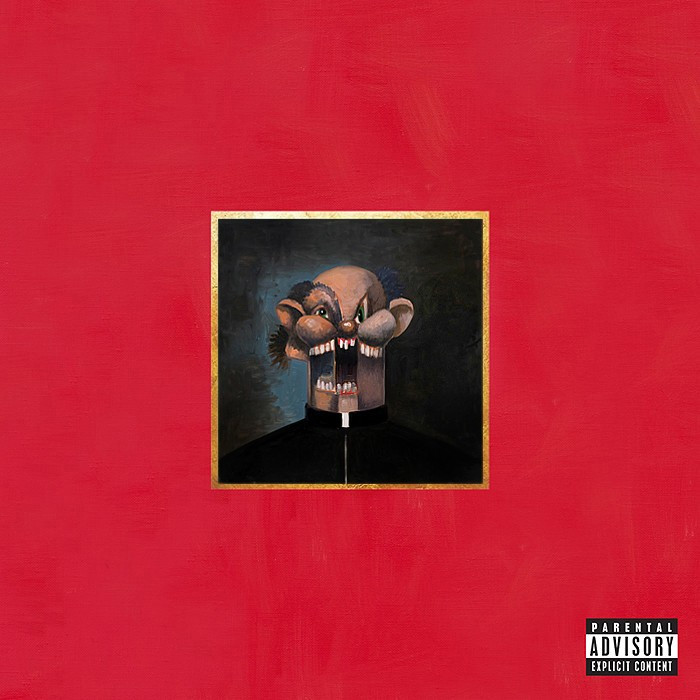
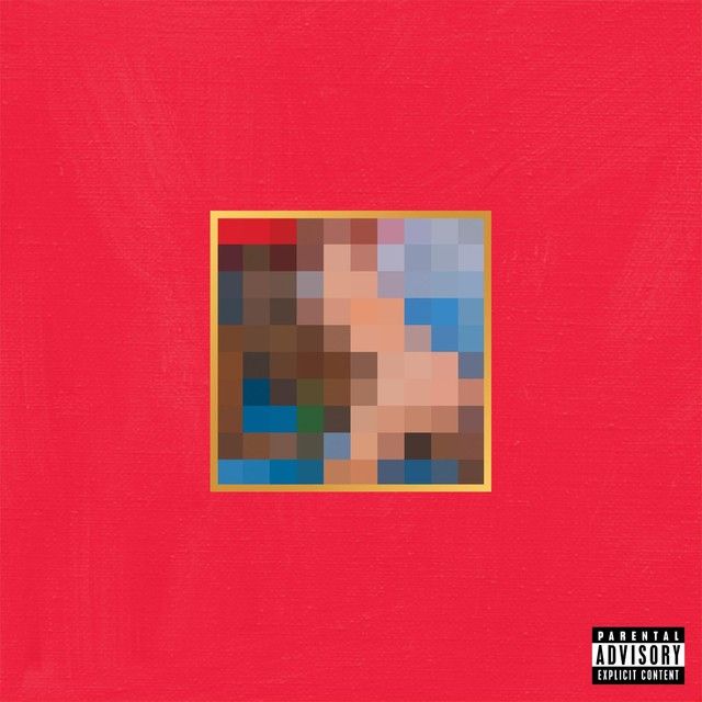
I am first going to compare and contrast works made by George Condo. The first piece of artwork I have chosen is the album cover(s) George made for Kanye West. Throughout the years, Kanye has been an influential artist in the music industry, changing the way music is heard and created, whilst at the same time being extremely controversial. One of the cover designs Condo created for Kanye included a drawing of a naked woman. This led to an online outburst and the image had to be censored on all streaming platforms.
My Beautiful Dark Twisted Fanstasy
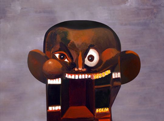
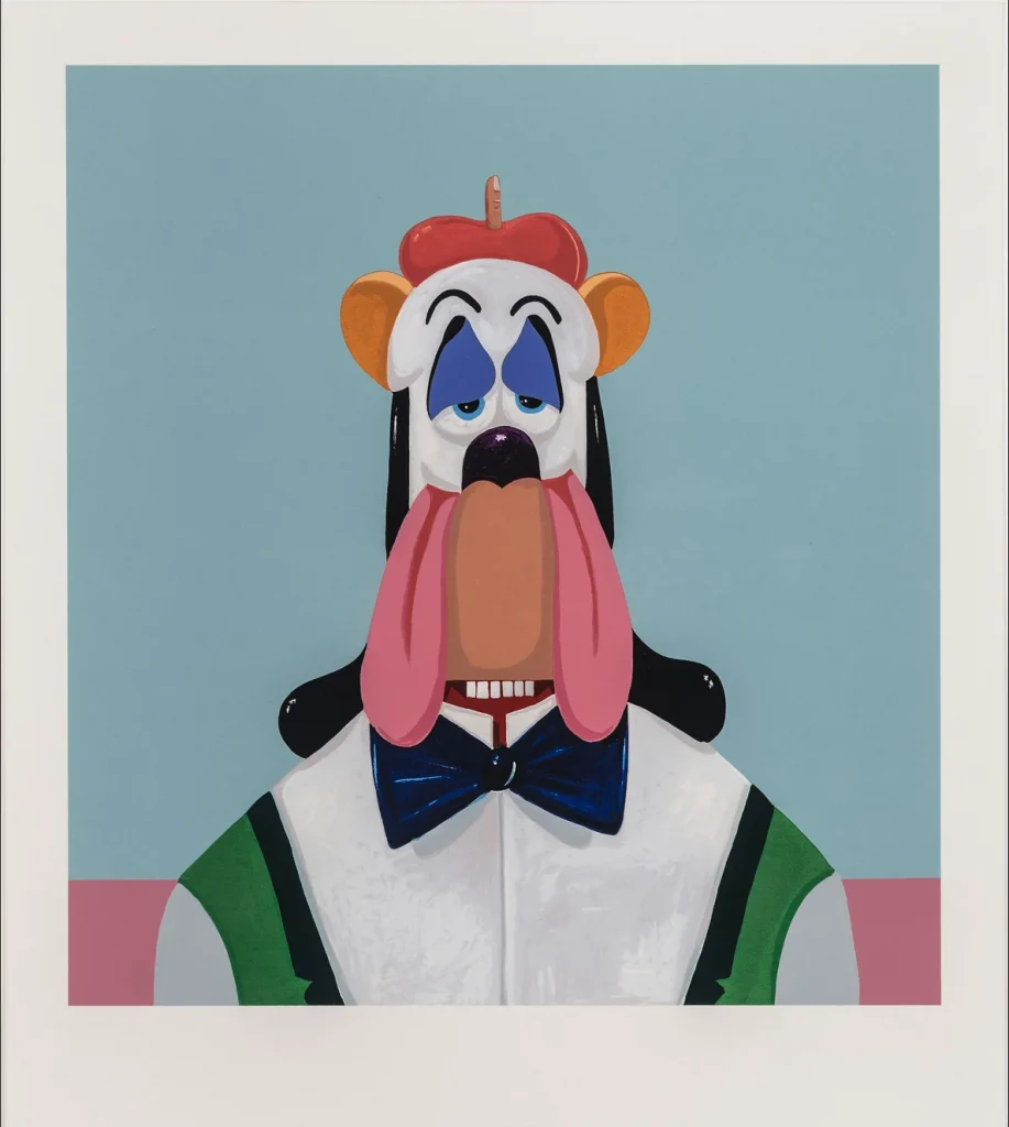
My Beautiful Dark Twisted Fantasy (2010) consists of around 6 Condo paintings with around 3 being rejected by Kanye and his team. I decided to study Condo and have a look at his other pieces of art, pieces which are influenced by Pablo Picasso’s but don’t follow exactly what Picasso style. Condo focuses on psychological cubism, he challenges the audience’s mind and their thoughts. He is also influenced by Willem de Kooning, and Goya, and after working with Andy Warhol in his studio, George Condo said in an interview that he has been inspired by his artwork. His style is modern/psychological Cubism and Impressionism, whilst it seems he is more focused on the cubism side of his artwork which makes his artwork standout from other artists. His art work varies from extreme psychological cubism to his pieces for Kanye which are somewhat realistic and less psychologically demanding. The atmosphere created for the 6 covers made for Kanye makes me feel somewhat uneasy as there is an extreme negative psychological theme towards all of the paintings. There are a wide variety of designs used, which some come across as controversial. I personally like some of the pieces, however am unsure on the rest due to the darker meanings behind the images. The use of controversial artwork in My Beautiful Dark Twisted Fantasy, featuring the naked woman and its censorship was intentional, the use of controversial artwork makes people talk about it, this leads to engagements on the album.
Condo's Work
George Condo is known for his prints and his paintings. In general, Condo uses a mix of charcoal, pencil, pastel and acrylic paint. The use of the red background with a golden frame makes the painting in the centre stand out. For the Black-swan type ballerina, the idea was created by “Condo’s wife Anna showed Kanye a slow motion clip of French dancer Sylvie Guillem dancing.”
Kanye chose Condo to create the rotating album covers as his artwork is similar to Ye’s psychological state. In 2016, “Kanye was hospitalised for dehydration and sleep deprivation, resulting to temporary psychosis”. Condo portrayed Kanye’s psychological state in a painting which “is a depiction of the many different Kanyes that exist within Kanye. It’s the God complex in him, the rapper, the producer, the artist, the fashion designer, the husband of Kim K, and the father of North and Saint all in one super disturbing image.”
Condos’ unique style of psychological cubism helped when it came to representing Ye’s album. In the cover called “Naked sphinx straddling Kanye” “That’s a good painting,” Condo describes, “She’s a kind of fragment, between a sphinx, a phoenix, a haunting ghost, a harpy. And then Kanye is also in some sort of strange 1970s burned-out back room of a Chicago blues club having a beer — so far away from the real Kanye West that it’s just a scream.”
This is the cover art which I decided to study in detail, as this cover brought up the most controversy of the album. The cover was instantly banned in Walmart and the Itunes store for obvious reasons. “The superimposition of people’s perceptions on a cartoon is shocking. What’s happening in their minds should be banned. Not the painting.”
Condo’s has work which is similar to the American artist Jean-Michel Basquiat who rose to success during the 1980s as part of the Neo-expressionism movement, with similar psychological challenging pieces of art and scribbles.
The artist has also made sculptures, paintings, drawings, and prints. Some of Condo’s artwork are direct responses to some of Picassos work, but majority of Condo’s work doesn’t look like Picasso’s. Condo was influenced by Picasso and his artwork. George Condo’s Princess (2008) painting is a clear representation of his influence from Picasso’s Femme dans un fauteuil due to the offset facial features and similar background colours. Condo creates grotesque work, with ridiculous shapes and designs, his artwork could represent Modern day grotesque comparing it the 1800’s and their gargoyles in churches which have similar comically or repulsively ugly or distorted designs.
Damien Hirst
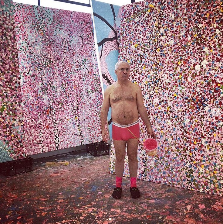
I am now going to compare and contrast works released by Damien Hirst. The first artwork I have chosen is some of his most recent work he did for Drake’s album – CLB (Certified Lover Boy) 2021.
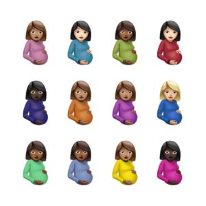
I am going to analyse the work of Damien Hirst’s design for Drake’s album. The design is extremely simple, which was mentioned frequently online. The cover art consists of 12 pregnant emojis, all with a different shade of shirt. With rumours circulating online, “The Drake cover is a combination of two Damien Hirst artworks. The Virgin Mother (2005) and Spot Paintings (2012).”
And “this CLB cover makes so much sense bc the album is 9 MONTHS late and is coming out over LABOR day weekend.” Suggesting that the simple design is not as simple as many might think.
I will now examine what the piece contains and how it has been arranged. One can say that the piece is extremely simple because it is 12 pregnant emojis aligned in a line of 4. With the background being a solid white, there is not much detail. There is no real mood or atmosphere created by this piece due to its simplicity, however with speculations about the design ideas, it adds a more personal and romantic atmosphere (if these speculations are true) But due to the artists, both Hirst and Drake, many people would be willing to pay for this artwork.
The technique used to make this piece was most likely photoshop, and is made by copying and pasting and changing the hue of the shirts of the emoji. It seems like the cover was made in under 5 minutes, which is similar to Hirst’s other work. But the meaning behind the design can be endless.
Hirst's Work
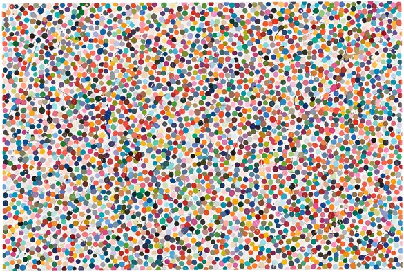
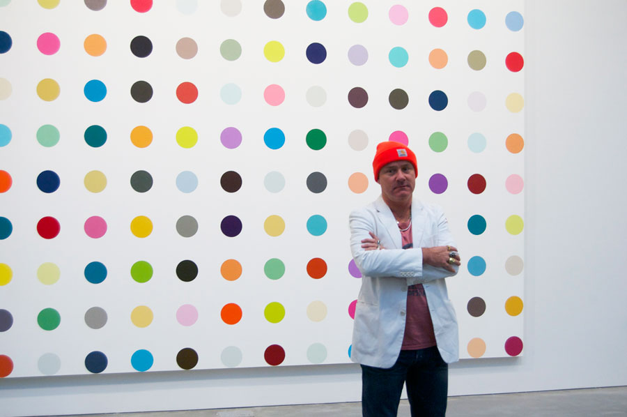
The artist has also made artwork similar to this, this includes multi coloured dots on a canvas “Spots”. This artwork follows a similar style to the album cover design for Drake, following the multi-colour design. Damien created over 1,000 spot paintings since 1986, which are all hand painted instead of having them printed by a machine. This shows Hirst’s technical precision. All of Hirt’s dots are unison in size and aligned in a grid. “I wanted to create a system where whatever decisions you make within a painting, the painting ends up happy”
“Damien Hirst is one of the richest artists alive, making his fortune by shocking the public with his sometimes hilarious, often arrogant but always mind-boggling imagination.”
Hirst’s artwork is based on consumerism whilst also linking to life and death. Consumerism is shown in his artwork through one of his NFT projects. Hirst created a digital version and physical version of the dots and allowed the owner of the NFT to decide whether they want to keep the NFT and destroy the physical version, or give away the NFT and receive the physical version.
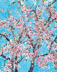
Life and death is shown through multiple of his projects, including his Pregnant woman statue “The Virgin Mother 2012” and now his artwork for Drake.
GOLDIE
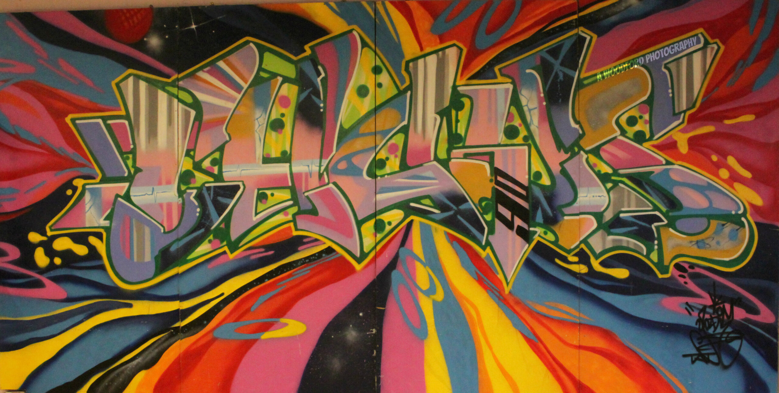
Goldie, Clifford Joseph Price MBE, was born on 19 September 1965, Walsall, is a Producer, DJ and graffiti artist. Whilst starting out as a Graffiti artist, Goldie was well known back in the 90s due to him pioneering the music scene. In 2007, he returned to the art world with an art exhibition, Love Over Gold, which was held at the Leonard Street Gallery, London. Goldie focuses mainly on his colours throughout his artwork.
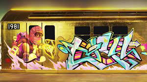
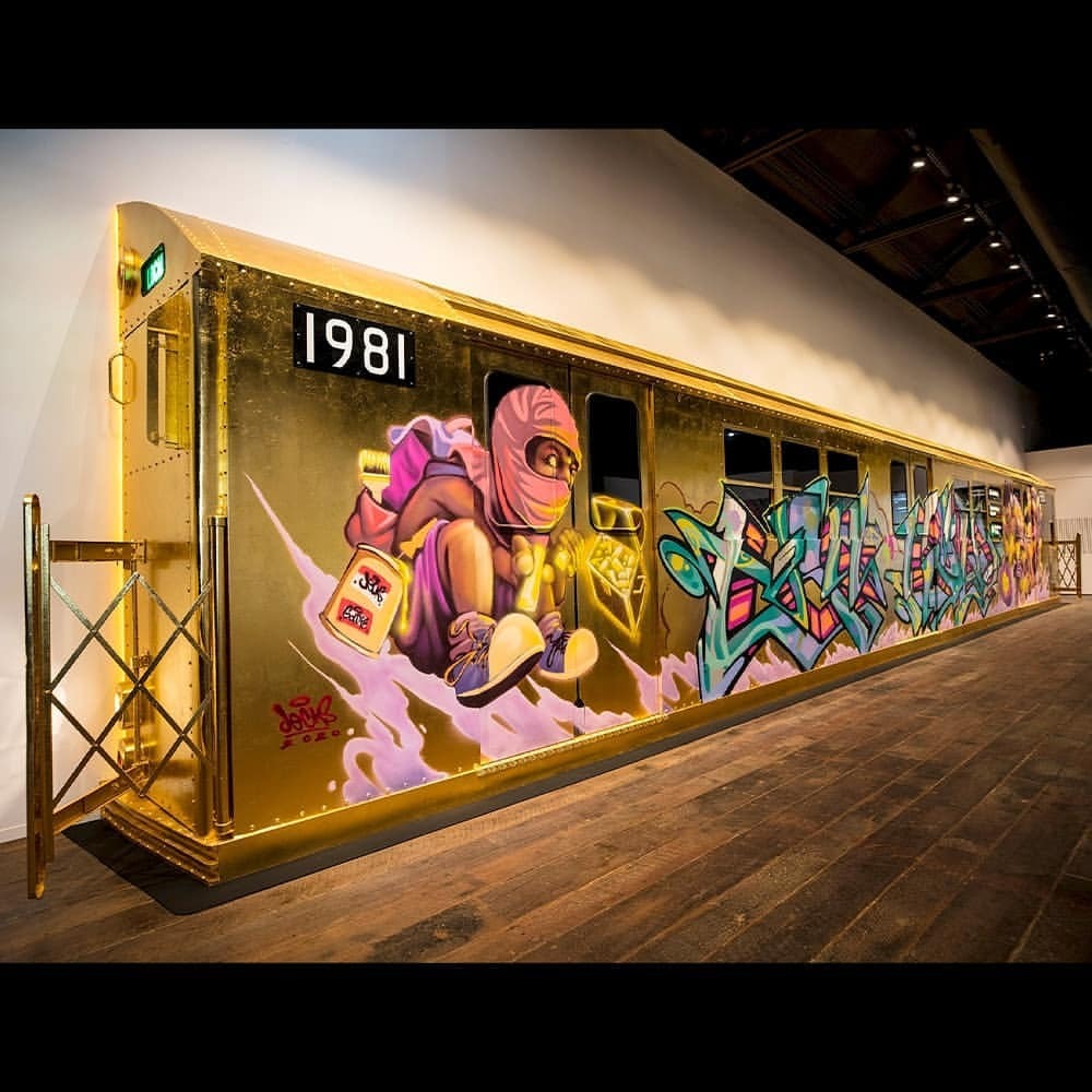
Being influenced by subway train art “For me, I went to New York in ’86 and I saw subway art, like most of us have seen subway art. And subway art blew me away, as far as graffiti was concerned. I understood graffiti as far as the letter form was concerned, but the social message was really important to me – these ghettos in New York and the pressure of people going there and the whole thing reflecting that in the UK of what that was about. And for me, it was no longer about writing your name, it was about the whole kind of letter form, and how that transcended in the UK.”
One of Goldie’s artwork includes a collaboration with himself and Jecks (an urban artist) is the Aurum Gallery Gold Train, where Jecks painted characters whilst Goldie focused on text both providing extremely colourful final products. The use of the diamond light blue and the light purple work very well on the golden background. Goldie’s design is a common style of subway and train art, whilst keeping that typical tag style, comparing it to Jecks design, which has a lot more detail, with cartoon human beings.
Combining the two artists adds the sense of realism to the artwork as graffiti on trains are not one consistent design, but in fact a combination of other artist’s designs.
Comparison of Condo Hirst and Goldie
There are few differences when it comes to these pieces, with one being a painting and the other being made most likely on photoshop (CLB HIRST).
However, both pieces of art were both displayed on online streaming services such as spotify, as they were made for two massive musical artists created by two big artists. George Condo’s designs are very different to Hirst’s, Condo’s were more psychologically challenging, showing Kanye’s mental state through the form of art, whilst Hirst went with more of an open approach. Both of the album covers are similar in size, roughly being around 3000×3000 pixels for the streaming service online (Spotify, Itunes/Apple Music). Goldie’s artwork is extremely different compared to Condo and Hirst. Goldie focuses mainly on colours, with vibrant designs or text, and he used different media compared to the other two artists. Goldie paints his artwork on the streets, instead of straight to canvas. Goldie’s artwork is based on the counterculture movement and has its political messages behind the artwork. All three artists challenge different issues in society, psychologically and politically. All three artists focus on shock tactics to force an audience to respond to their creations. Hirst’s use of emojis to create the cover for Drake is an example of his shock tactics to promote the album.
Conclusion
In the two covers made by Condo and Hirst, they both have hidden meanings behind the pieces of art, which are not instantly clear when first viewed. I want to try to implement the idea of something physiological/controversial into my final piece, having ideas which are not instantly clear when first viewed. I liked Goldie’s artwork and would like to try to implement something similar in my own artwork. I will look at Goldies use of typography and colour and try to add similarities into my work. However, I will not be using a Condo design as I don’t believe it will suit my brief well.
In my final piece I will use a mix of media to create it, ranging from using CAD software to create Laser-cut designs to Photoshop. I have been influenced by the use of these album covers and music related artwork to create a fake festival. I want to focus on marketing similar to Hirst’s and his use of pushing his luck, mocking people with the outcome. I want my final piece to represent something which should not be taken seriously and is somewhat satirical.
Final Piece
Please wait here and dont scroll down yet
Introducing...
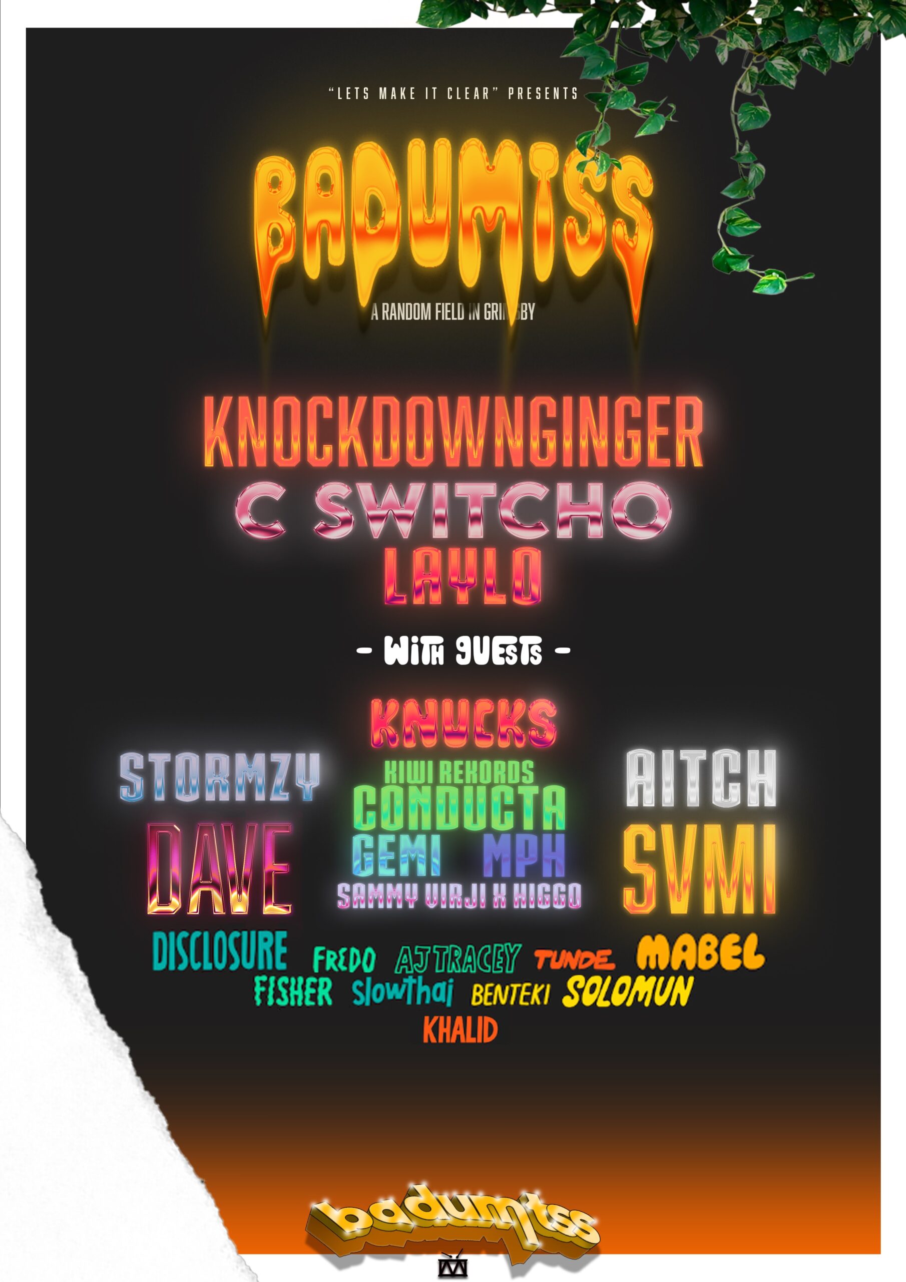
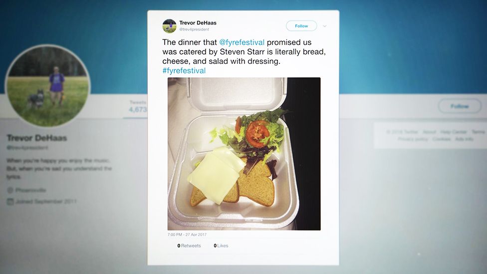
I chose to show the type of people which will be attending the festival, showing the target audience of the festival. Links to Fyre Fesitval’s promotion video where its showing everyone having a fun time with massive smiles of their face, despite the blatant lies being told.
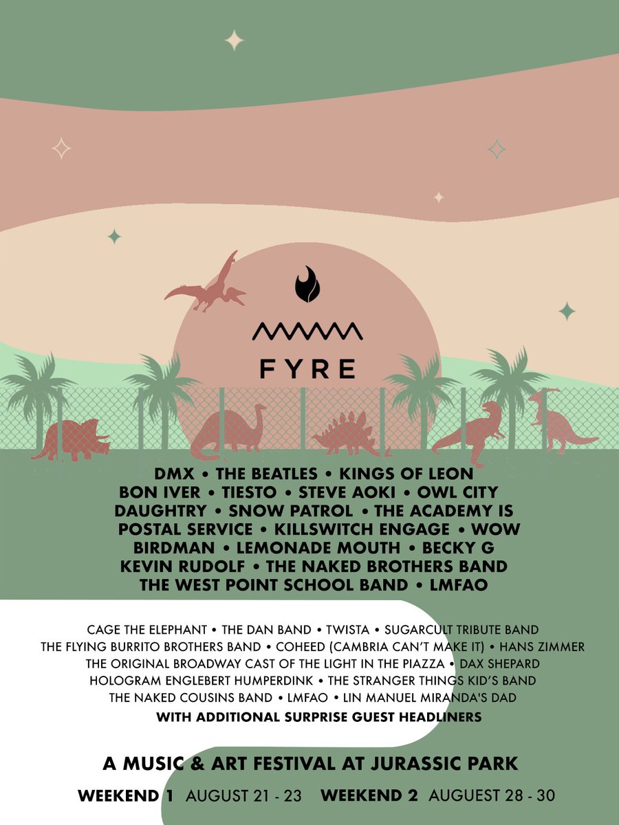
My brief was to create a graphic package for a fake festival which builds up hope and attention similar to Fyre Festival, whilst linking it to my personal study where I looked at psychological artwork which withheld information from the viewer creating mystery.
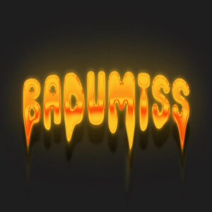
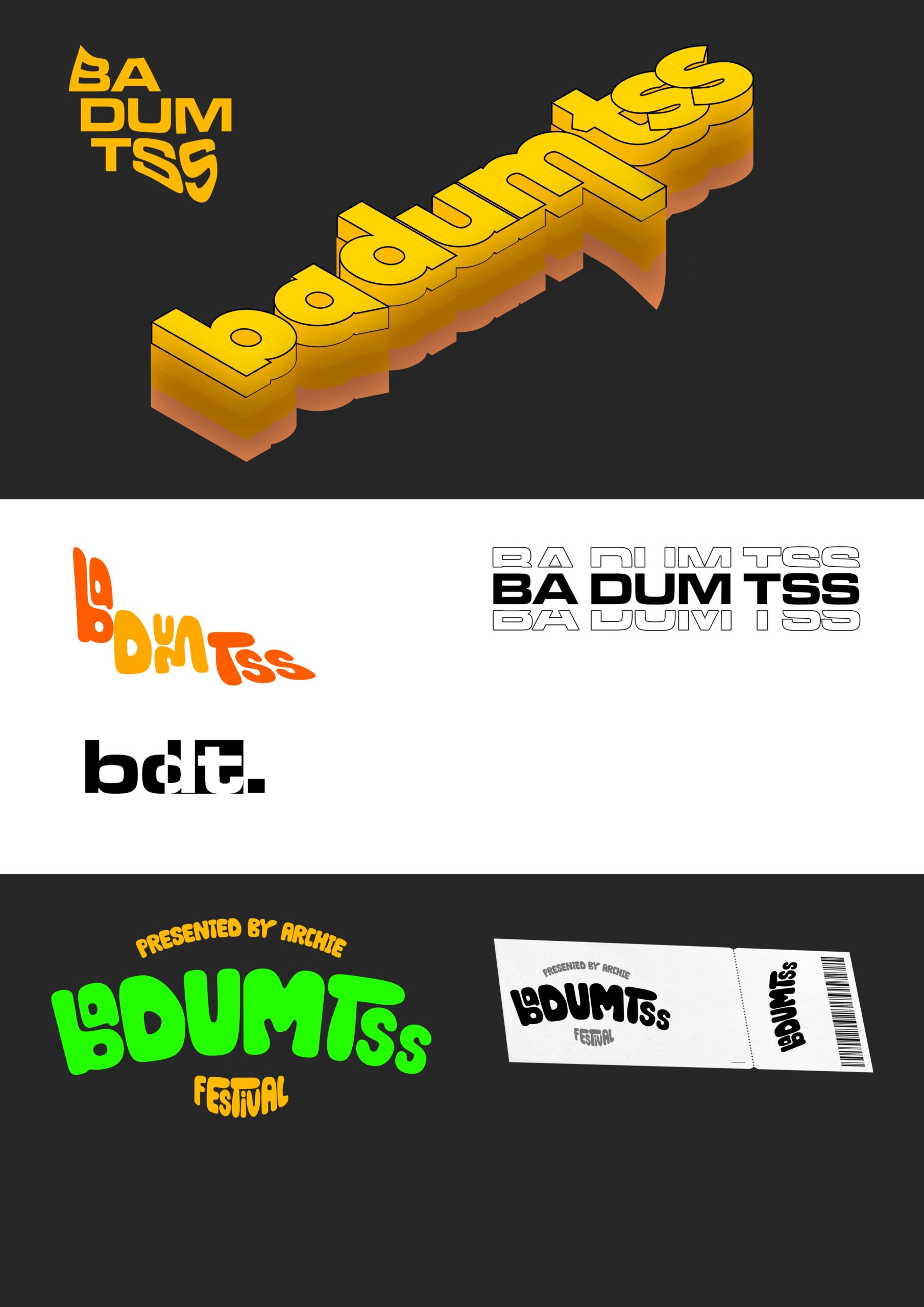
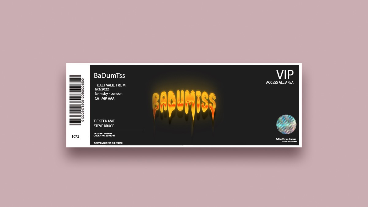
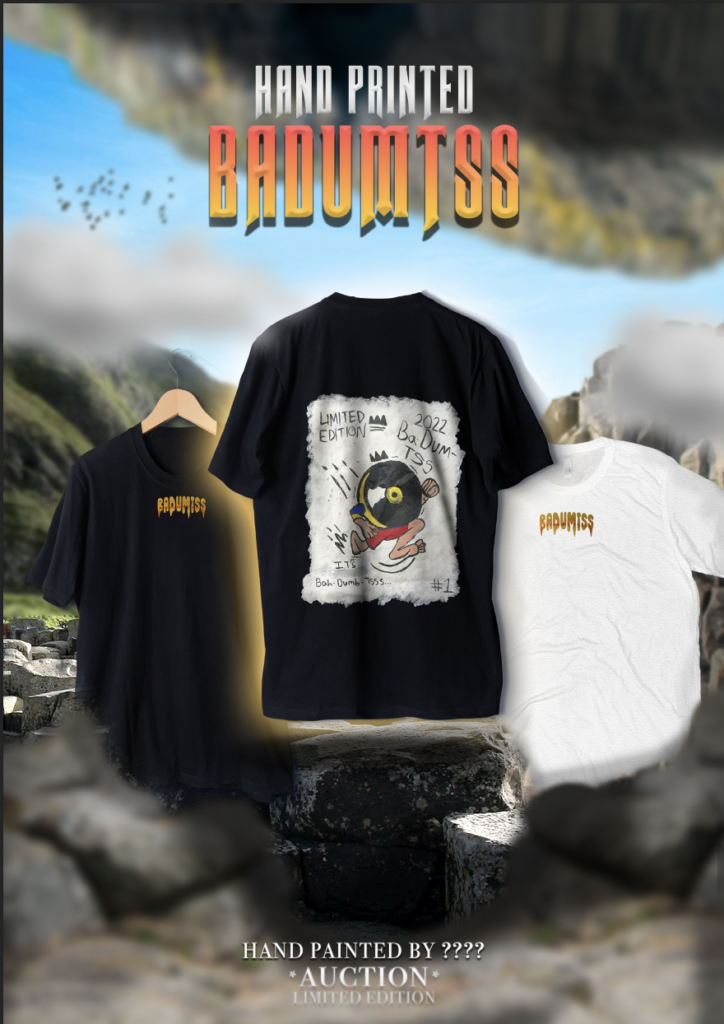
The festival name Ba DUM Tss is the well known sound played on the drums after a joke, which links to my aims of what I wanted to create. The name links to Music and then Fyre Festival, as it was a “S***show.”
I created 3 t-shirts by screen printing on the front of all three, and hand painting on the back of one creating a “limited edition shirt”. I hand cut the stencils of multiple different sizes to see what would look better on the tshirts.
I decided to paint over the heat transferred design as it looked cheap, there was no colour to the design after being transferred and ruined the back. However, by painting on the back the design using acrylics, I created something unique and will make people think about the design. I used the element of surprise by not saying “who painted the back” implying that it was made by someone special and important, I showed this off in the T-Shirt advertisement poster. This links to Fyre Festivals promotion as they promised once in the life time opportunities which ultimately fell off.
I created multiple VIP Artist passes which design started off with a rough mockup in my sketchbook, comparing different wooden thicknesses and what media works on top. I then used a soldering iron to create an initial idea, this didn’t turn out as planned but it gave me a rough idea.
I then created a digital version of what I wanted to laser-cut out on photoshop, I created a solid black and white design which made it easier to transfer into Lightburn, as by using the tracing feature on lightburn relies on solid, clear lines adjusted by the threshold to trace the image onto lightburn to cut. The laser-cut lanyards turned out very nice and what I wanted to create in the first place. I messed around with the laser cut settings to cut, fill and burn and they are all slightly different. I sanded the badges down to avoid splinters and beveled the edges to avoid stabbing into anyone wearing it. The thickness and size were planned carefully to create something which is ergonomic and safe, whilst being something which they wouldn’t throw away. I decided to use wood as the lanyard as it is more “environmentally friendly” compared to plastic and the aim of it is for it to be stored as a memory instead of being thrown away.
I created a promotional video and uploaded it on youtube to “promote” the fictional festival. I used premiere pro to cut and change the order of existing festival footage and synced it with a new song, whilst adding the badumtss sound effect before the drop during the animation/stinger transition I created on After Effects.
Overall, I think I created something which represents the brief whilst pushing it to the max, mocking Fyre Festival.
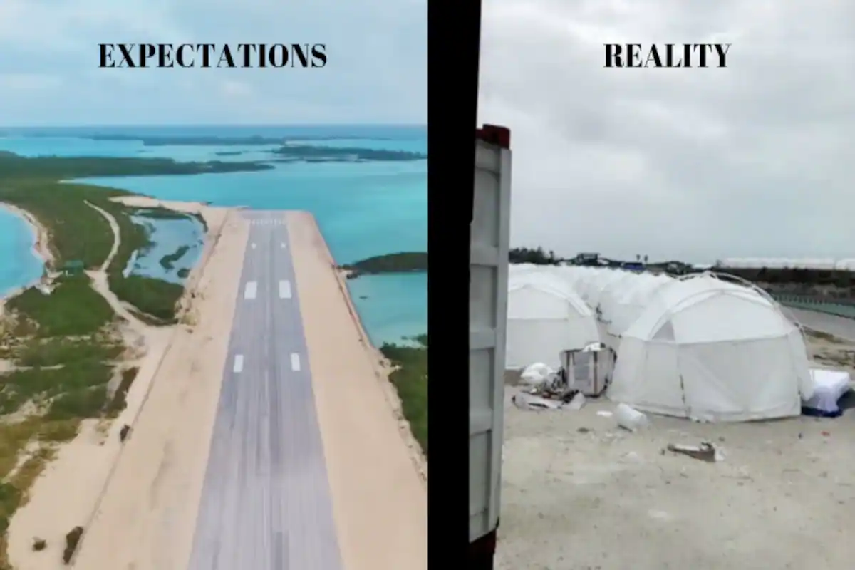
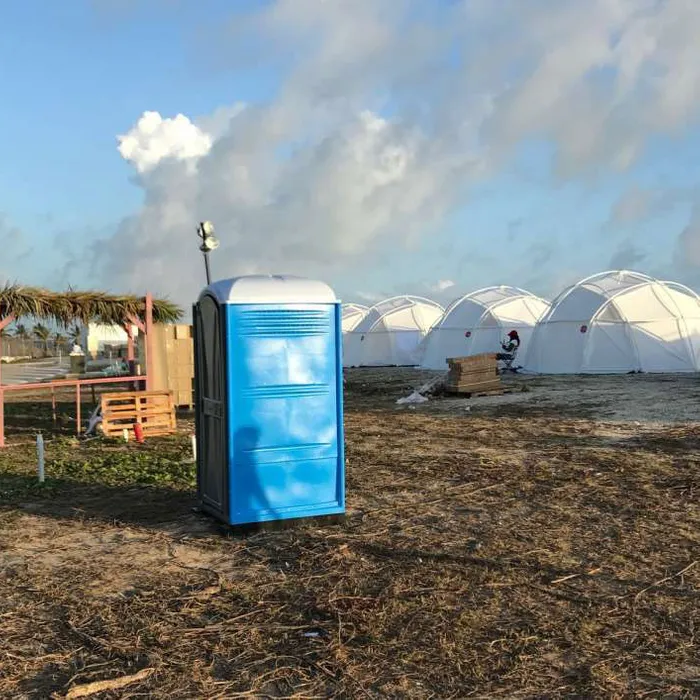
Fyre Festival
Fyre Festival was a festival full of scams, fake promises and disappointments. It was promoted and rumoured to be the greatest party ever to exist, however the expectations met the reality of the party goers. Their smart advertising however is what gathered my attention when creating my final piece, the use of an empty orange square posted by “influencers” on social media created an element of mystery and unkown